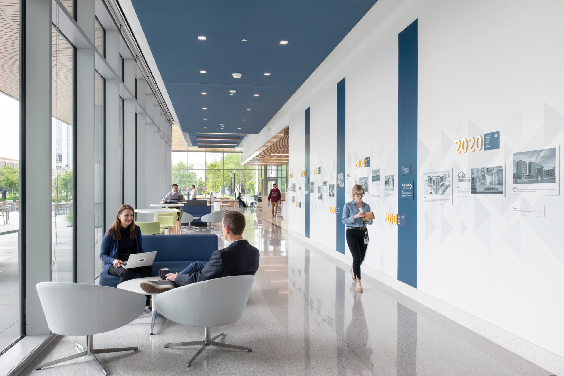
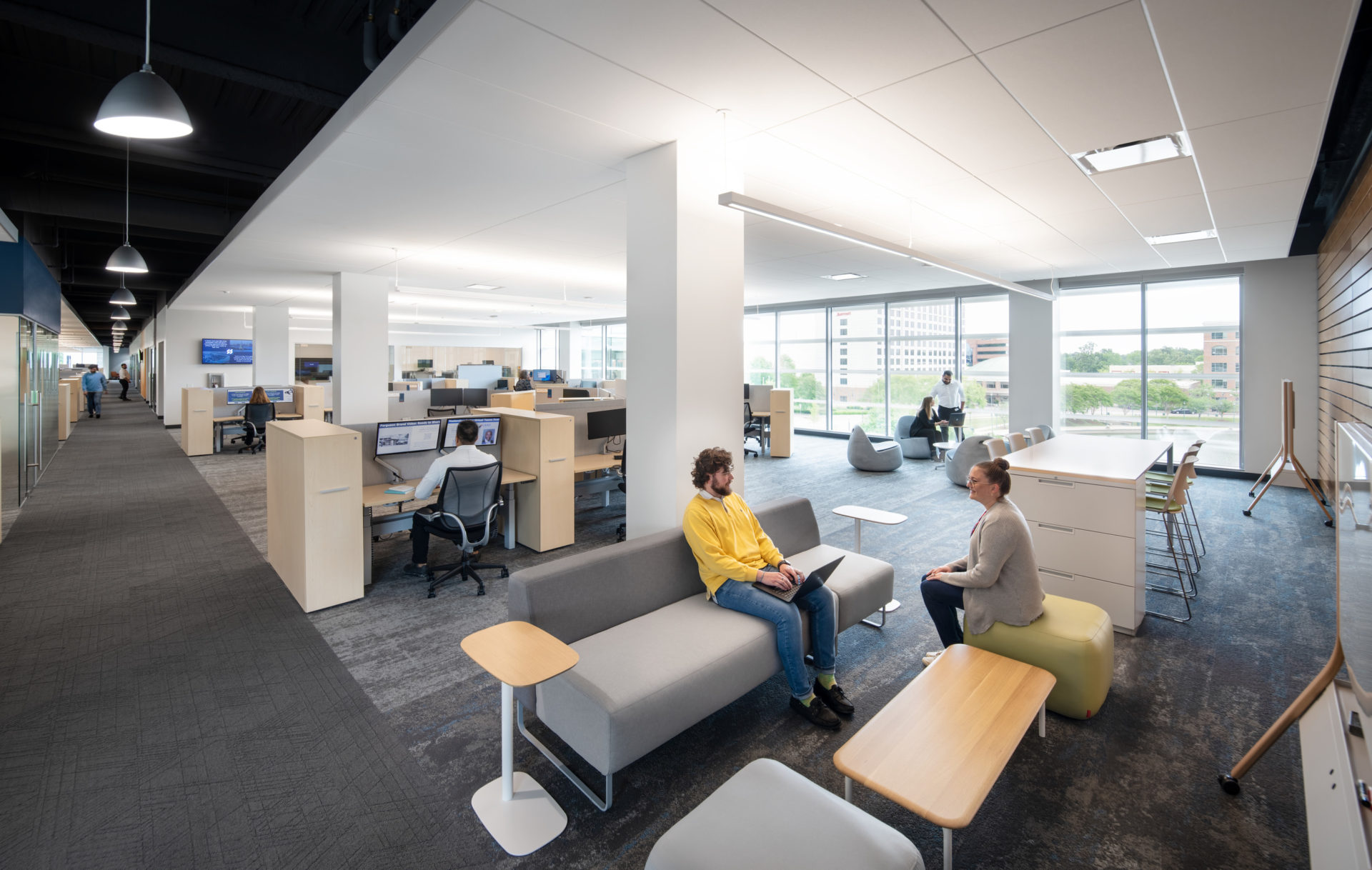
Driven by goals to break down silos and enhance collaboration, the commercial interior design for Ferguson HQ3 establishes a functional, team-centric space. The project team has outlined a bold vision that eliminates perimeter, private offices in favor of open office layouts and diverse meeting and shared spaces. Intended to transform the company culture, this strategic design effort is expected to yield long-term growth and success.
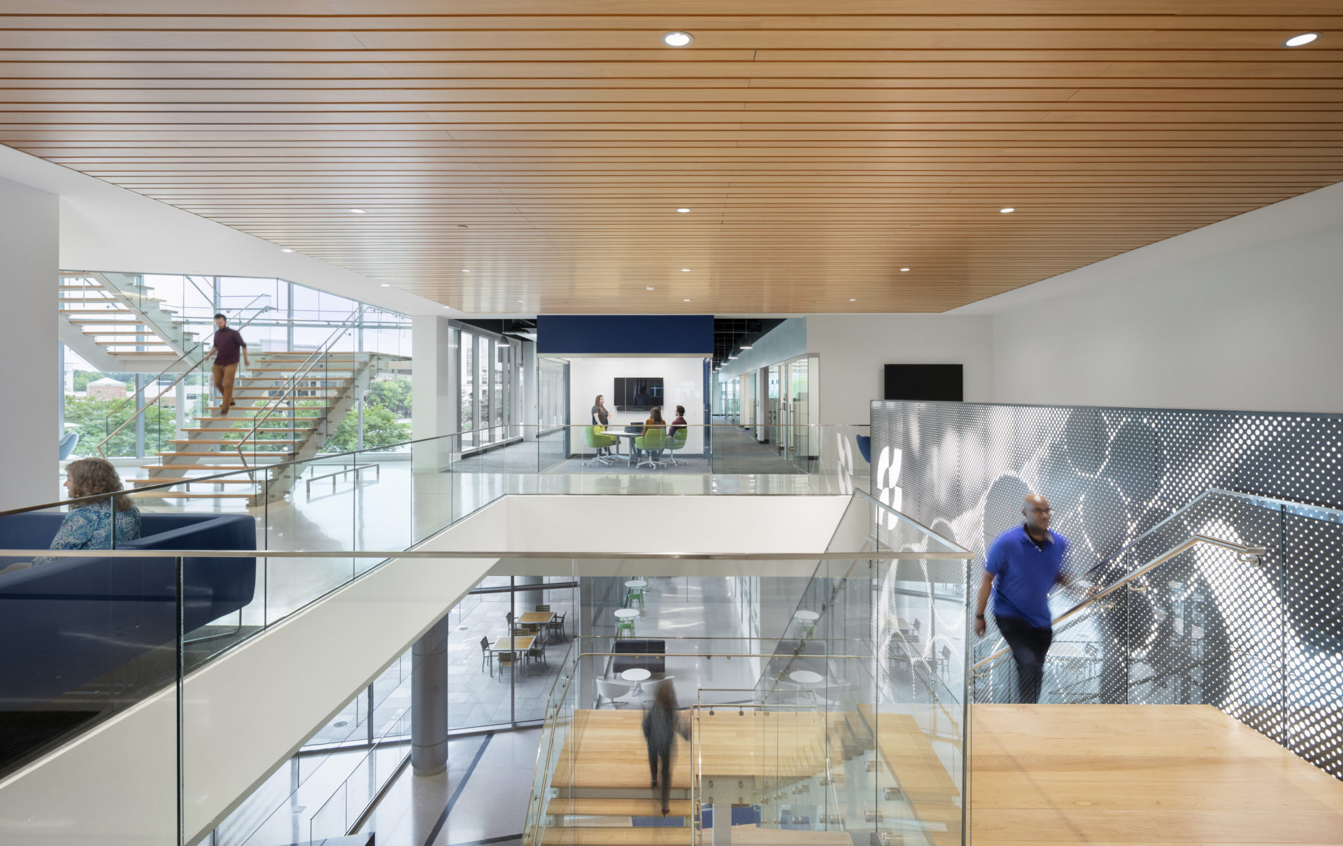
The interior layout of HQ3 demonstrates how influential aesthetic and infrastructural change can be in the employee experience. Sleek and streamlined from the inside out, Ferguson’s aspirations are to spark agility and flexibility within departments and ultimately attract and retain top talent. This impressive 260,000 square foot facility encompasses eight floors of innovative workplace design, with complementary details and colors highlighting the function and character of each space.
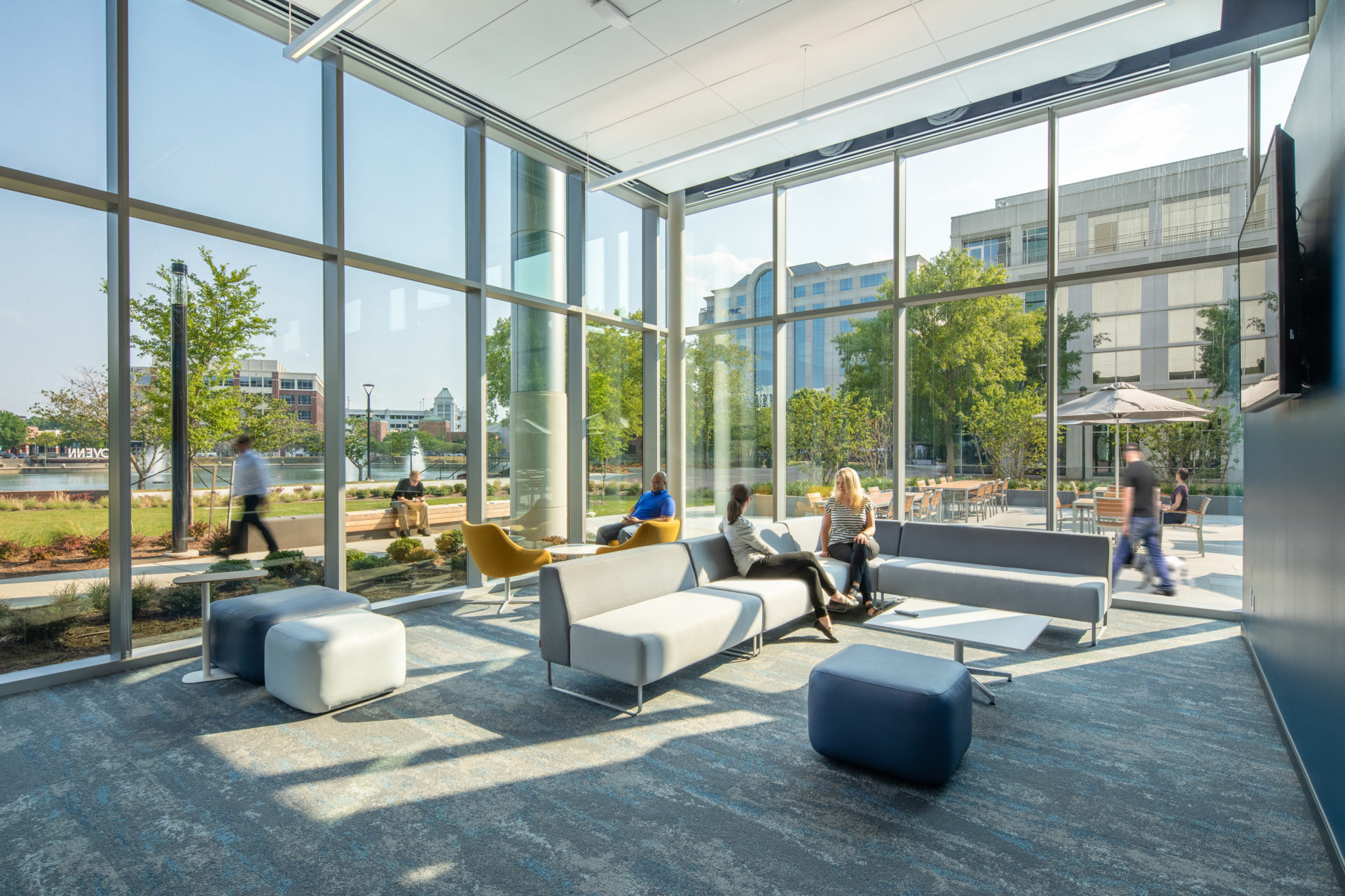
Unlike a traditional office structure, the spaces in HQ3 are unique – with open training areas designed to be flexible, open surfaces and workstations equipped with USB adaptors and outlets for a transient workflow, and soft seating and lounge areas for breaks or casual conversation.
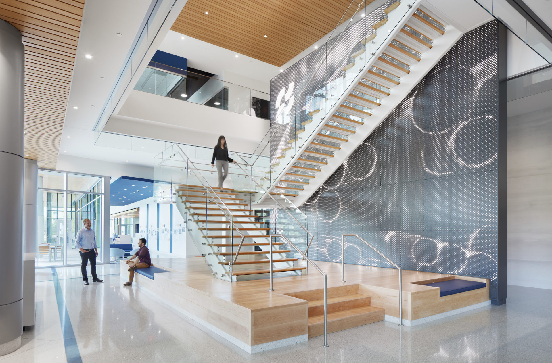
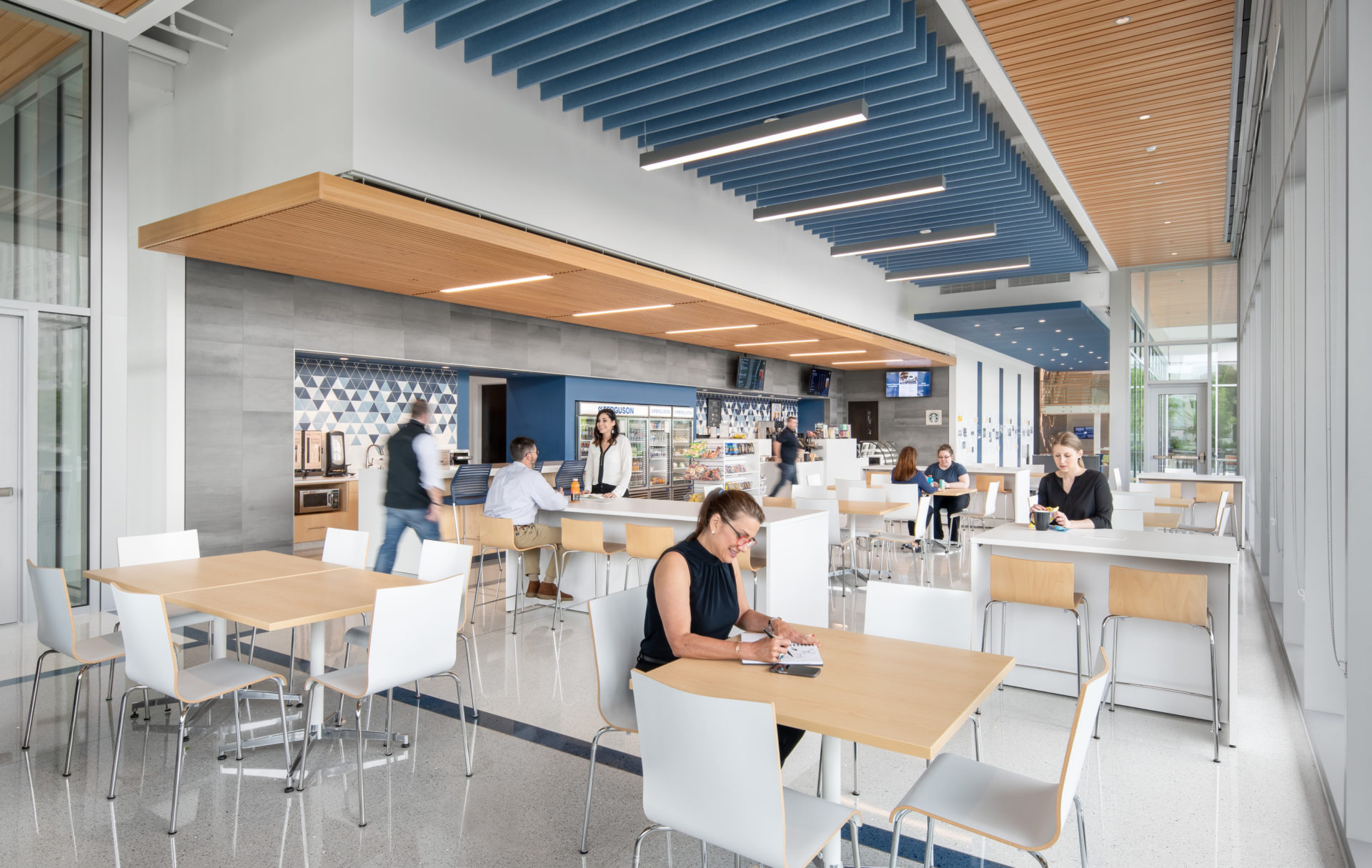
The first floor showcases this “think different” design. Along with the training and flex spaces around the perimeter of the lobby and dining area, a designated space for presentations offers a versatile alternative for group collaboration. Equipped with a tiered seating system, this area is multi-purpose, allowing for speakers, webcasts, meetings, and presentations. The bleacher-style seating has cushions for comfort and features built-in power and USB stations for associates to utilize laptops and devices. The eighth floor also houses a unique design element created for the sales team: an open space for showcasing new products. This demonstration space allows associates to interact with products and materials visually and physically to gain deeper insight in support of customer relations. For key spaces, Ferguson engaged their own vendors to create custom lighting fixtures, highlighting the tie between the company’s work and their culture.
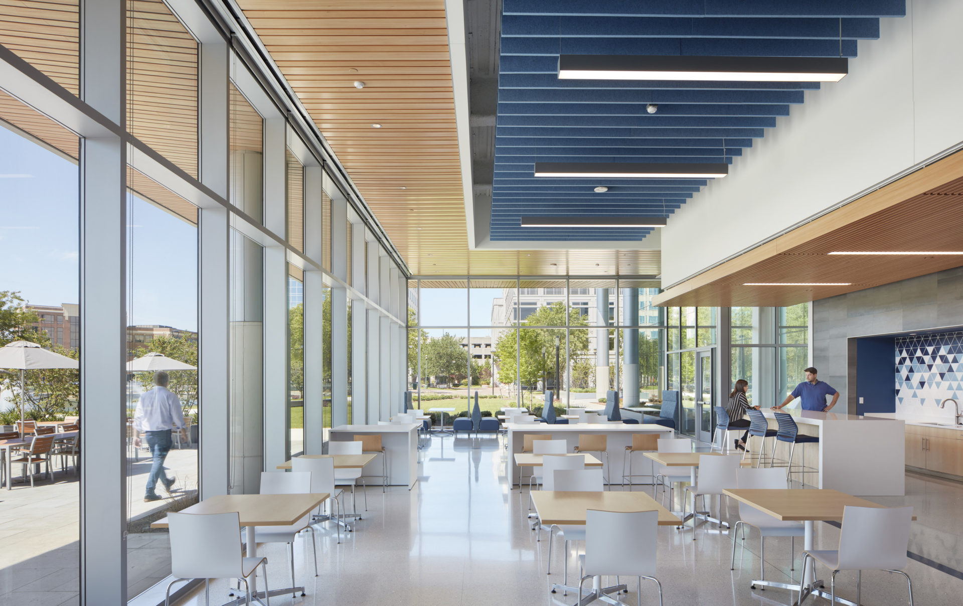
Aesthetically, much of the facility features a monochromatic palette with pops of color. The interior design tastefully complements the exterior through geometric design and generous natural light. A lively combination of modern and industrial elements convey a cutting-edge workplace while clearly delineating workstations and amenities. To counteract potential noise transmission in the open spaces, great attention was paid to acoustics throughout the facility. The use of felt baffles in training rooms, the dining area, and other open spaces work with other soft surfaces to absorb traveling sound. Sustainability was a priority in design and the project is pursuing Green Globe Certification.
