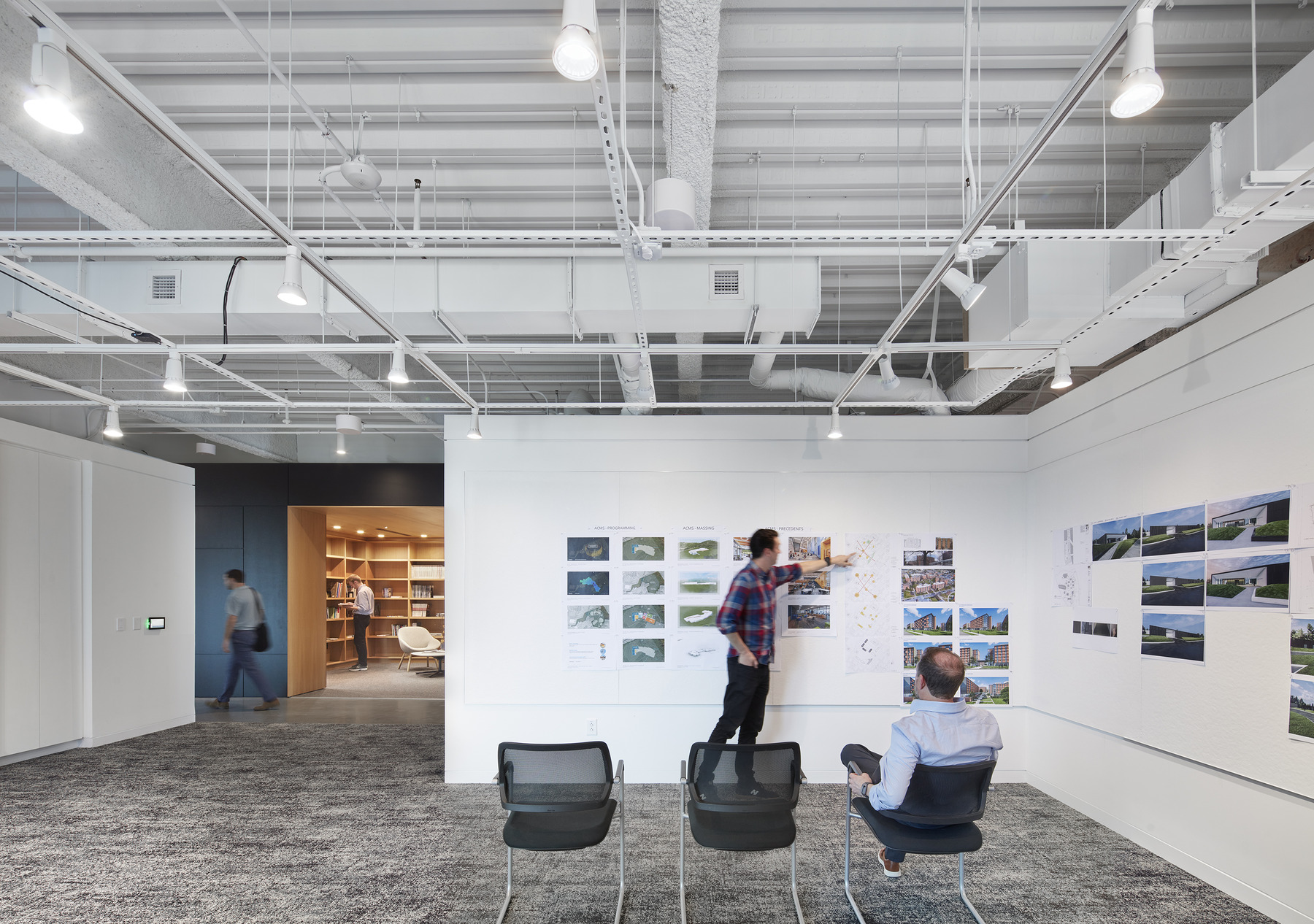
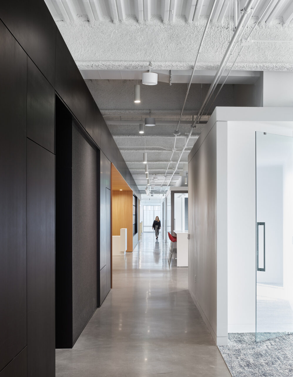
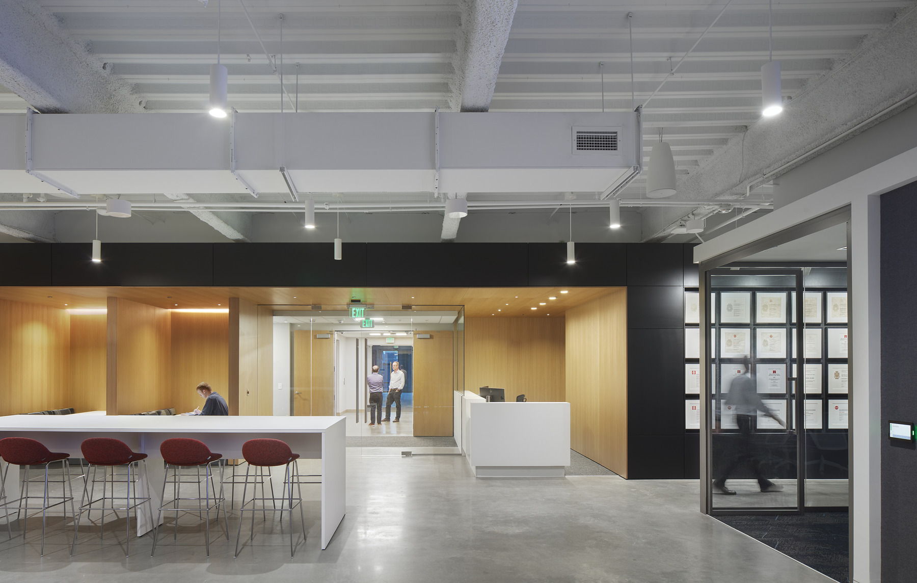
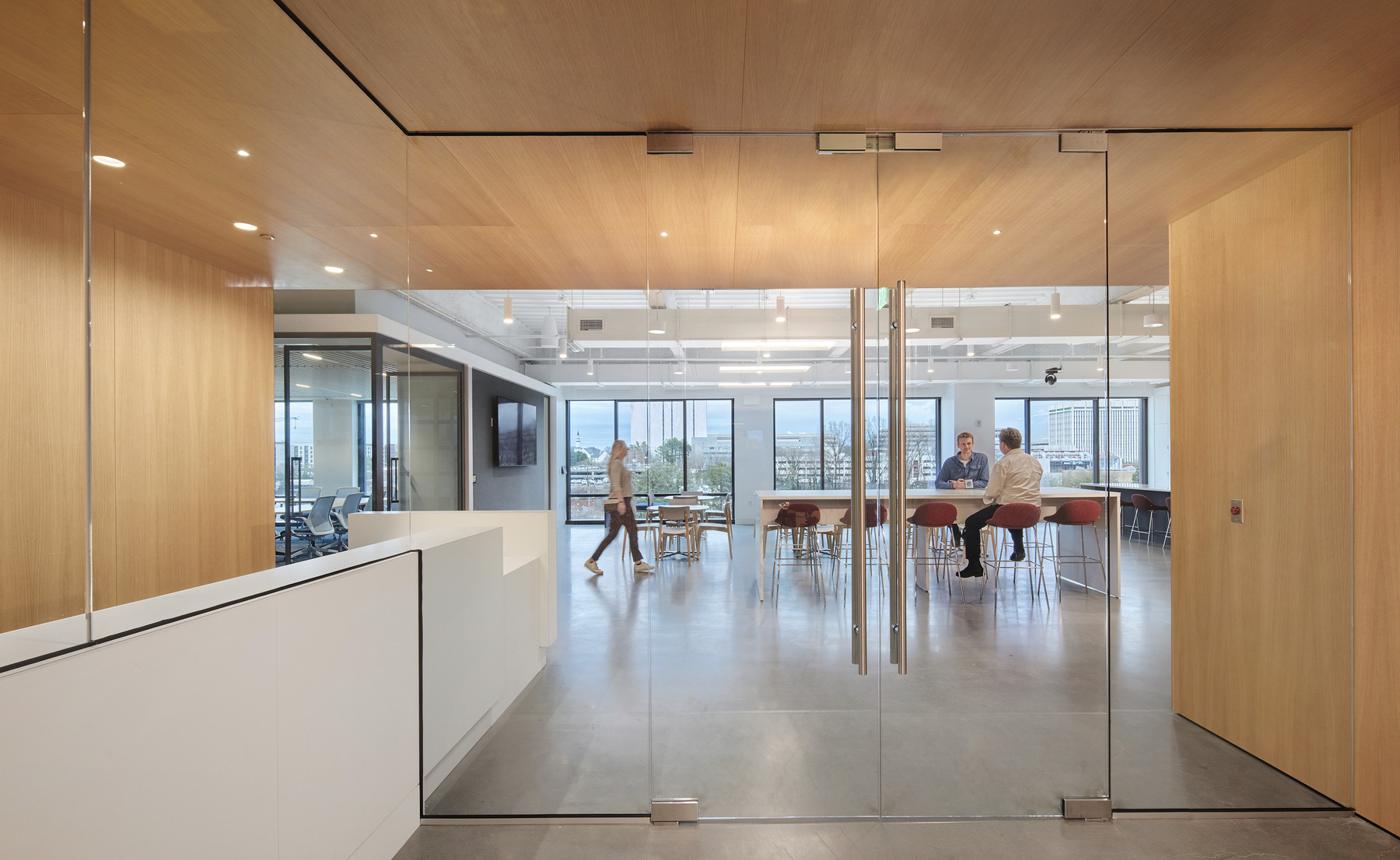
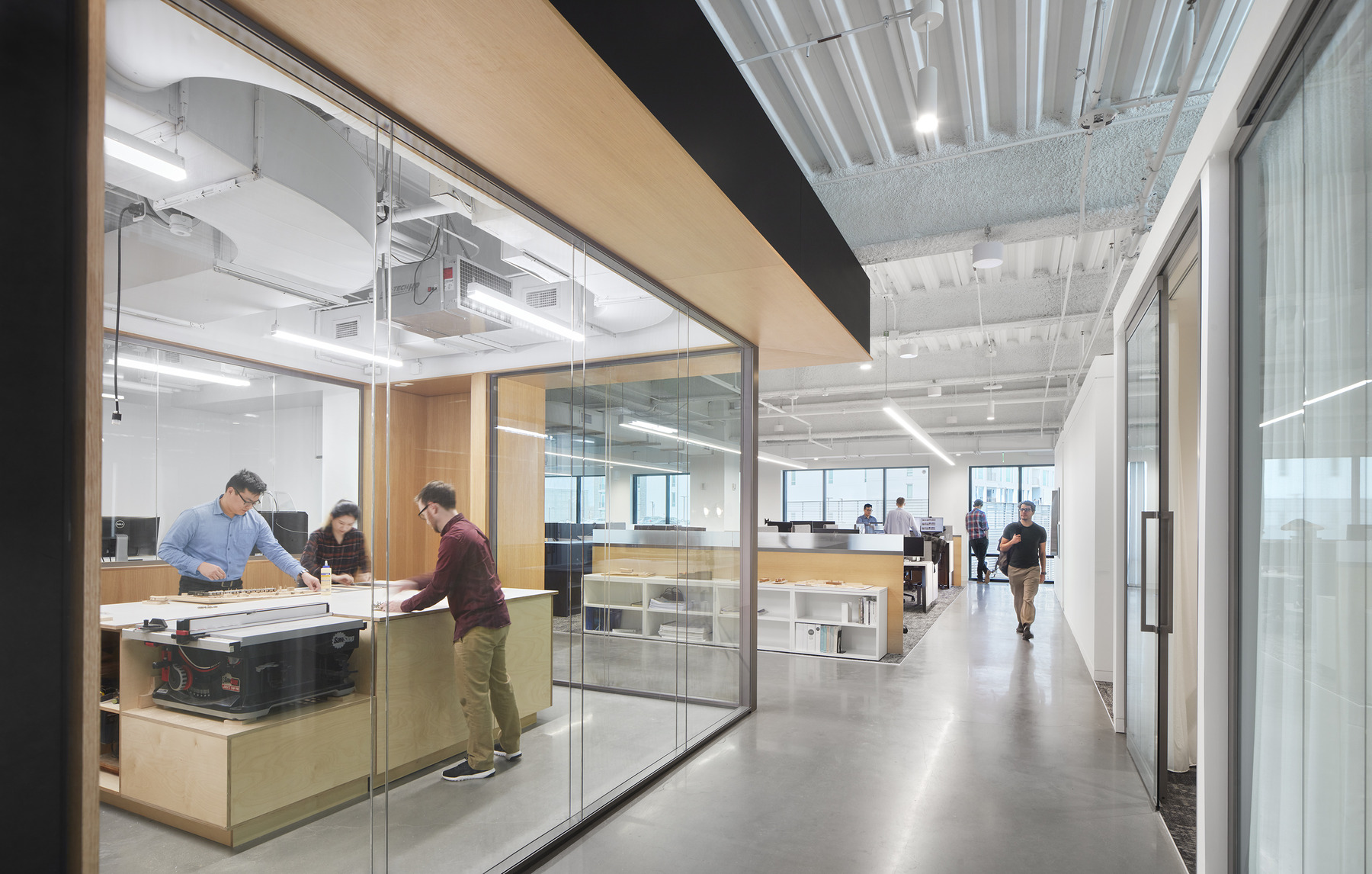
Clark Nexsen’s Raleigh office upfit transforms one floor of an existing office building by making connections to daylight, framing views of the city skyline, and promoting the firm’s commitment to collaboration, design, access to resources, and employee well-being. The office utilizes a clean and open layout, with natural light, shared common spaces, quiet areas, and maker spaces that allow employees of all disciplines to work together.
Designed With and for Collaboration
With collaboration being one of the key components of the new design, an all-office charrette was organized. We established three teams who researched similar precedent projects, materials that minimized waste that could be locally sourced, and analyzed space layouts that encouraged interaction between staff.
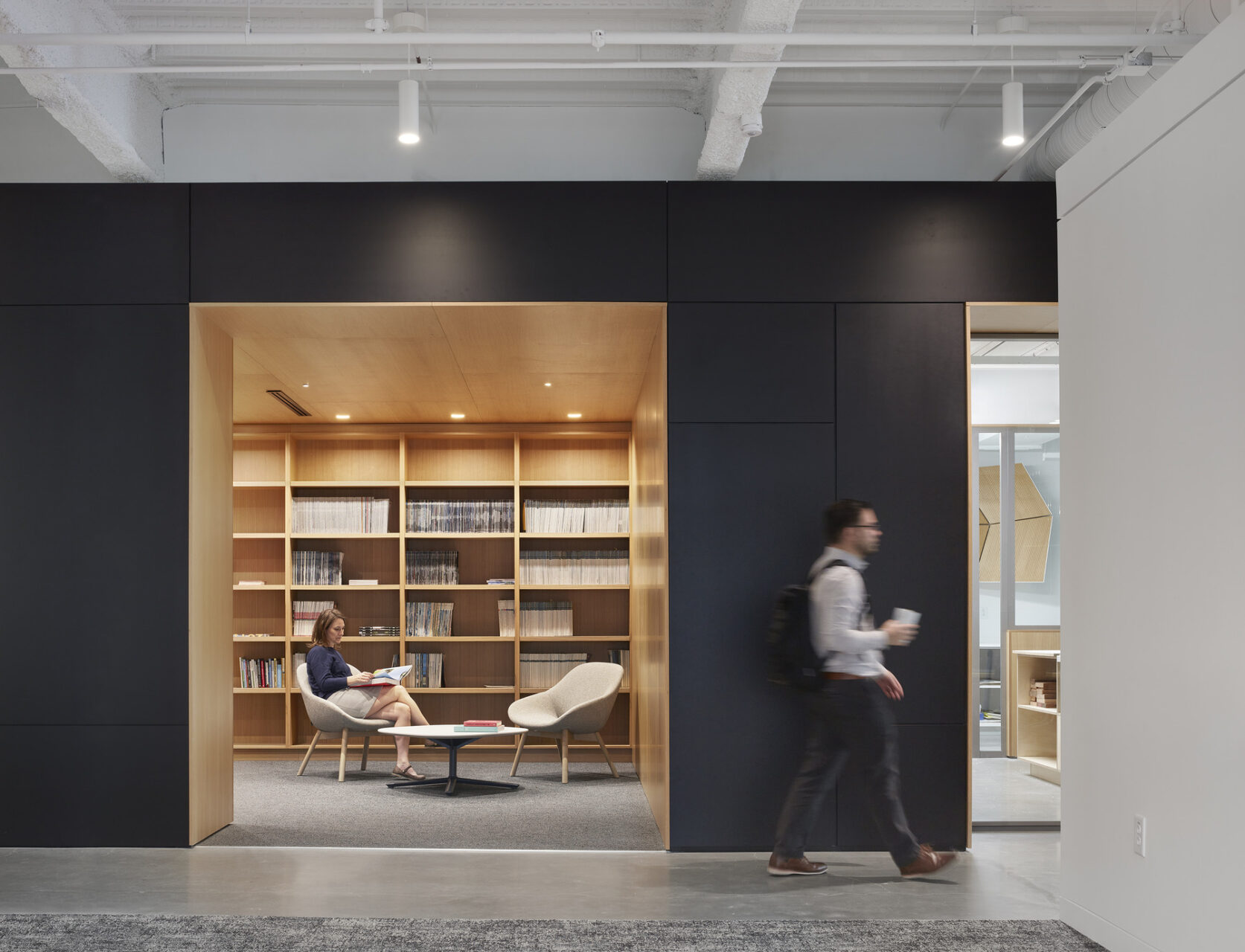
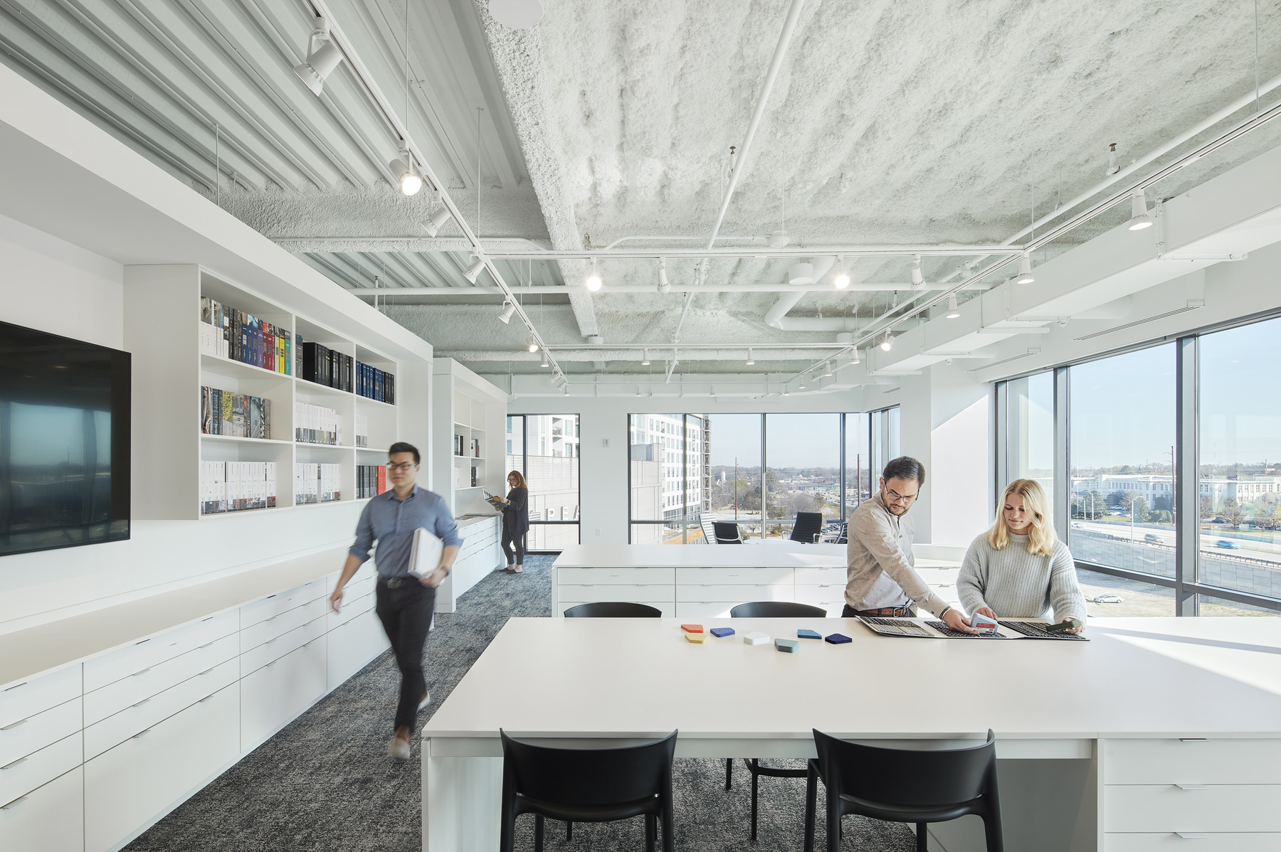
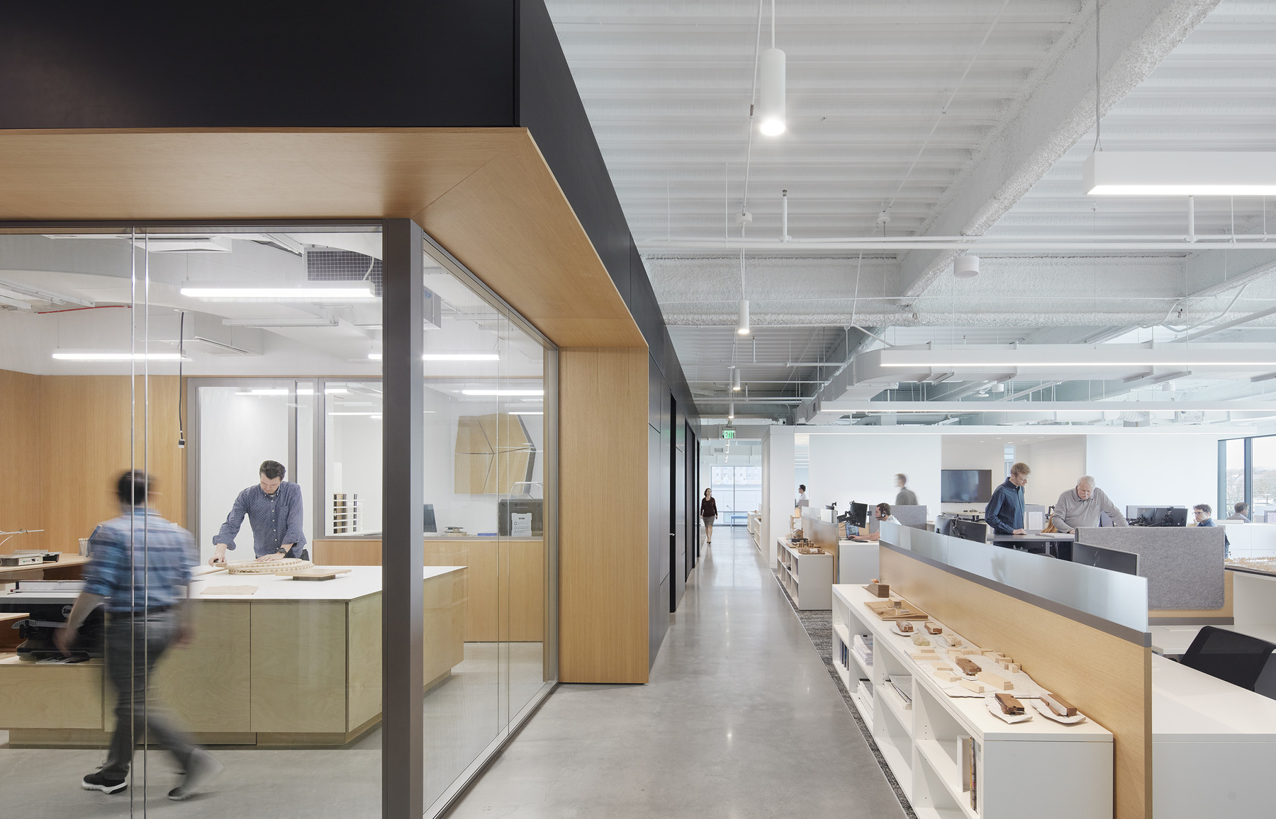
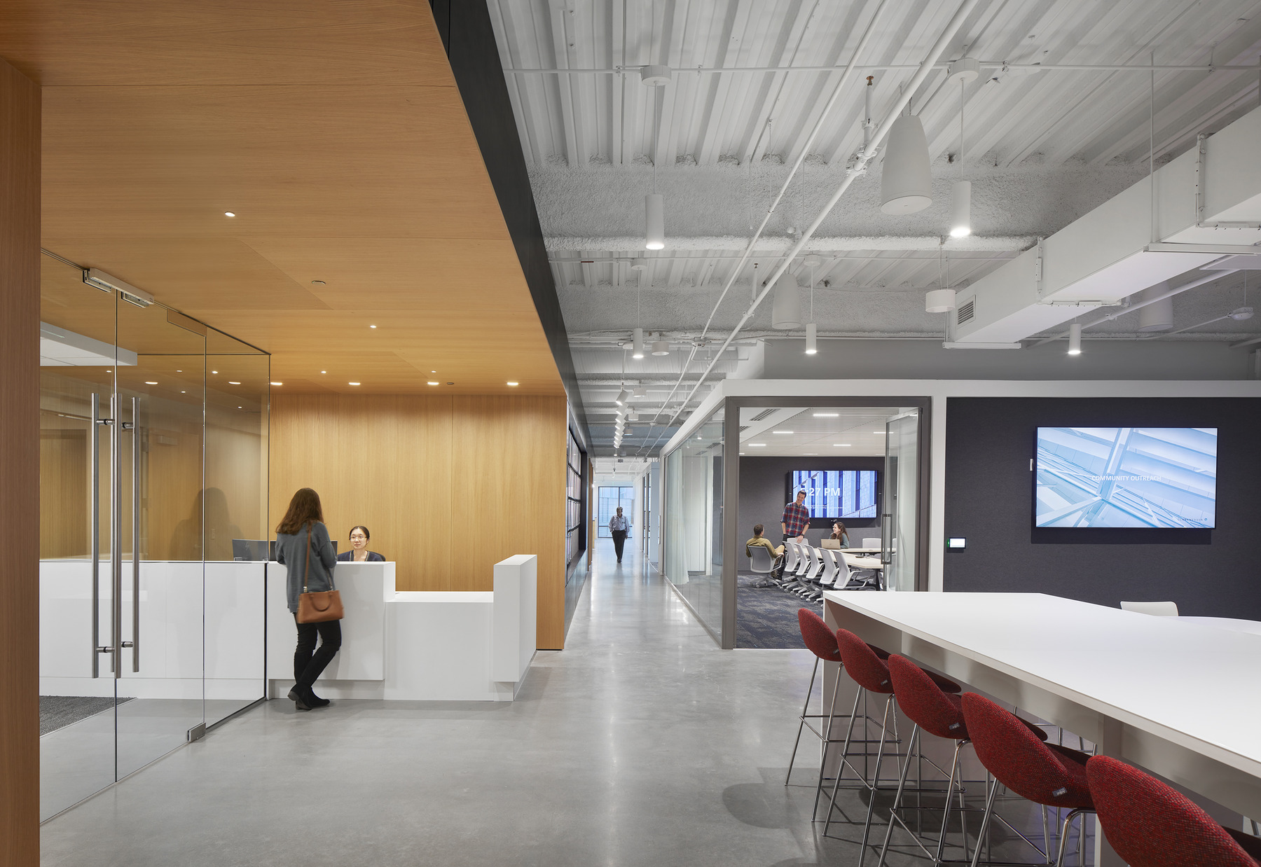
The plan locates utility spaces into a thick, black MDF “wall” around the building elevator and stair core. Deep carves into the wall, each lined with white oak paneling, highlight shared common spaces such as the library, maker space, and various collaboration spaces. These spaces are specifically located to be accessible from the design studios and highly visible along the public path. Public spaces are organized as contrasting white elements along the east curtain wall, affording views toward the Raleigh skyline. The remainder of the office is organized into two open studios, one on the north side and the other on the south side, separated by discrete and permeable white huddle rooms available for project and team meetings. Open workstations, transparent conference rooms, and common spaces allow daylight deep into the floor plate. All circulation corridors are kept open at the end with views out to the surrounding context.
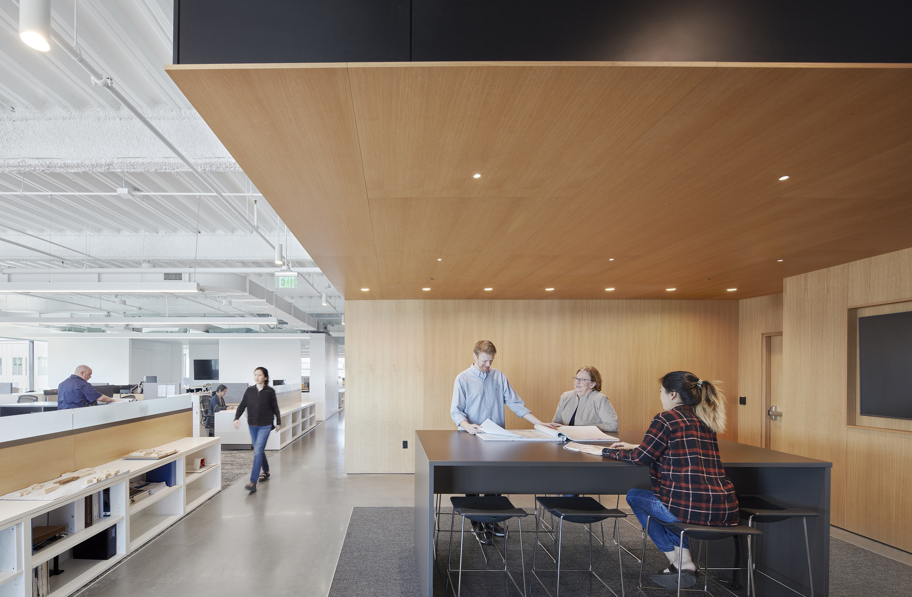
“This new space has become a place to collaborate, have chili cookoffs, enjoy tomato sandwich days, host award events, and feature guest speakers. It’s more of an extroverted space than anything we’ve been in before.” – Rob Harkey, Senior Architect
Our design charettes also informed us that common spaces and opportunities for collaboration would be vital. Small touches, such as taller counters, allow people to stand and talk on either side. Our model shop was also designed with collaboration in mind. With acoustic glass on two sides of the room, providing effective sound dampening from just 10 feet away, it is one of the most distinctive spaces on the floor. Introducing transparency and placing the space adjacent to the design studios reinforces the idea that our design ethos is about making.
Material Well-Being
When designing the space, there was a conscious decision to choose materials that reduce volatile organic compounds and enhance indoor air quality. As a result, no faux materials or hazardous byproducts are used in the office: wood is wood, concrete is concrete, and MDF is MDF. White was the only color used on the project, providing a clean and crisp appearance throughout the space. Additionally, white was used to highlight the contrast in colors from the surrounding environment, allowing everything from the furniture to the blue and green hues of the Raleigh skyline to stand out.
“To deliver a project like this is an extension of our values, and the whole team bought into that.” – Dennis Stallings, Principal and Design Director
Our office space was designed with WELL ideologies in mind. Open offices, meeting rooms, and the café are filled with natural views, offering plenty of natural light to employees. LED lights are used exclusively throughout the office, with occupancy sensors to reduce energy and daylight sensors that lower the lights automatically when there’s enough natural light. Employee comfort and accessibility were also crucial factors in our design. Our new office location was chosen for its proximity to mass transit and pedestrian-friendly neighborhoods, encouraging walkability. We worked closely with staff to find new workspaces that were ergonomic, height-adjustable, and comfortable. Acoustic zones – such as our small focus rooms – were designed within the layout to provide quiet environments for conference calls or private meetings. Support for mothers was also built in, with a discreetly located lactation room with access to water, a refrigerator, and a freezer.
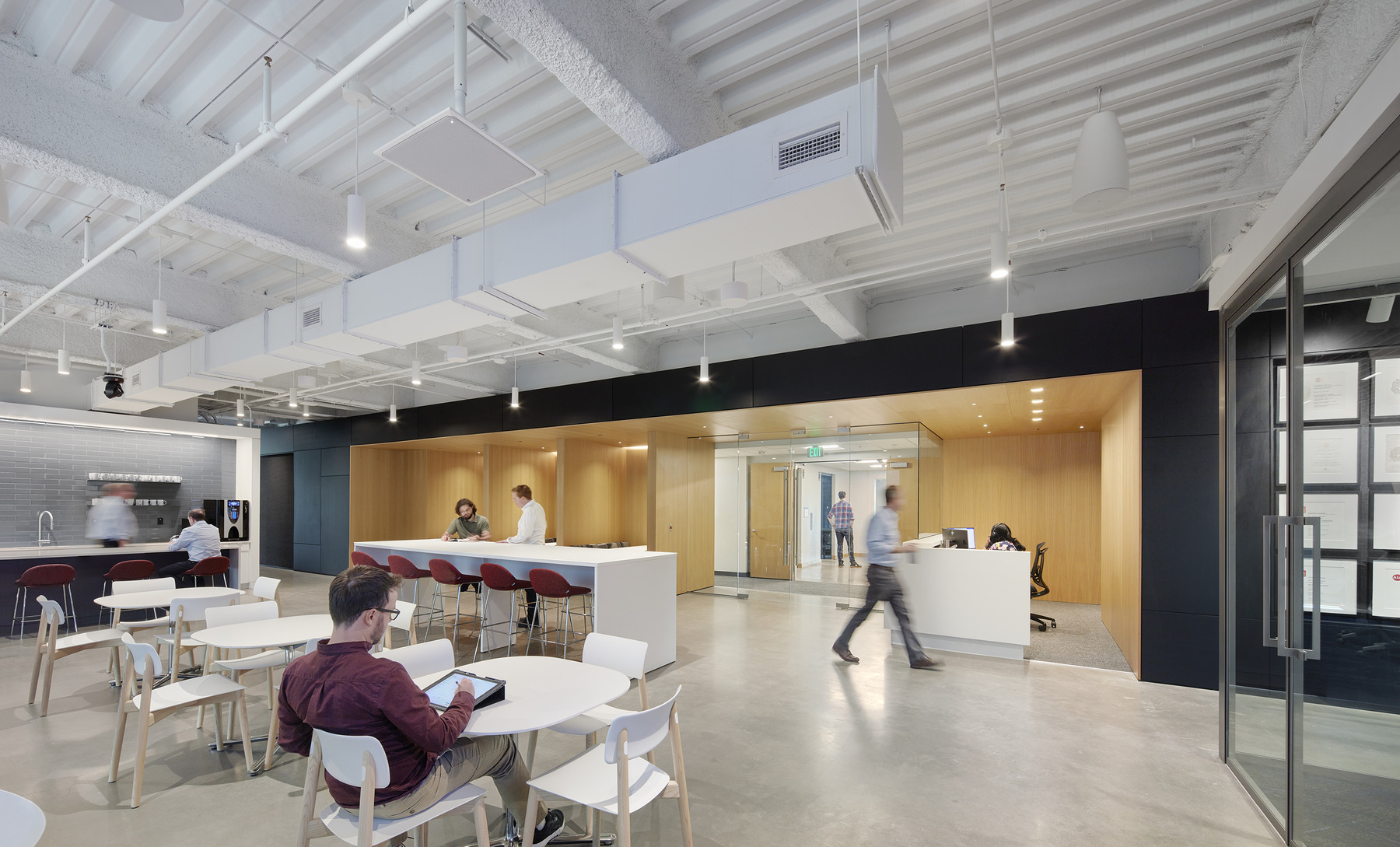
Well-being efforts have continued to date. Clark Nexsen is setting up an interface to monitor indoor air quality that is accessible to employees through a database. The office encourages mindful eating and drinking with healthy snacks and filtered water in our café. Additionally, groups within the office have created programs to promote mental health and well-being.
After spending 26 years in the same location, Clark Nexsen’s new home in downtown Raleigh was an opportunity to showcase the firm’s design acumen and create an office that meets employee needs. The upfit provides upgraded facilities while giving employees opportunities for teamwork, privacy, and well-being. By working closely with our staff, we have created a space that will be a center of creativity and collaboration for years to come.
Awards
AIA North Carolina Merit Award, 2024
AIA Aspire Merit Award, 2023
