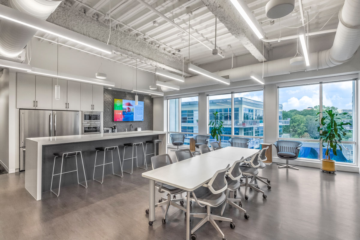
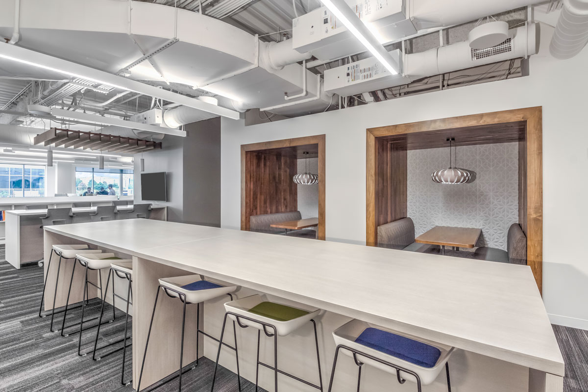
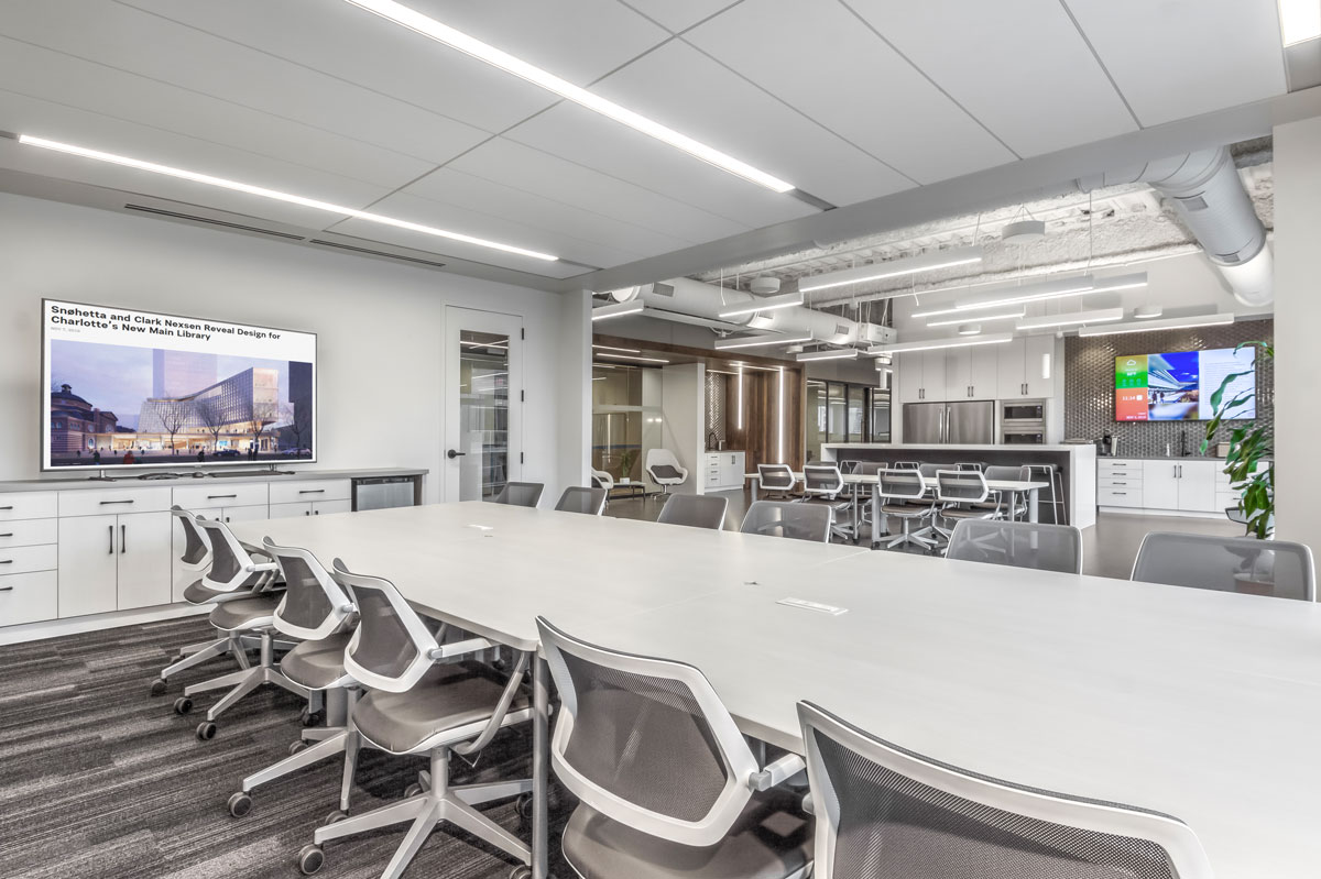
The design of Clark Nexsen’s new Charlotte office centers on promoting collaboration, features flexible, modern spaces that emphasize visibility and foster connectivity. The new office embraces a light-filled, open concept layout that enables different disciplines to seamlessly work together.
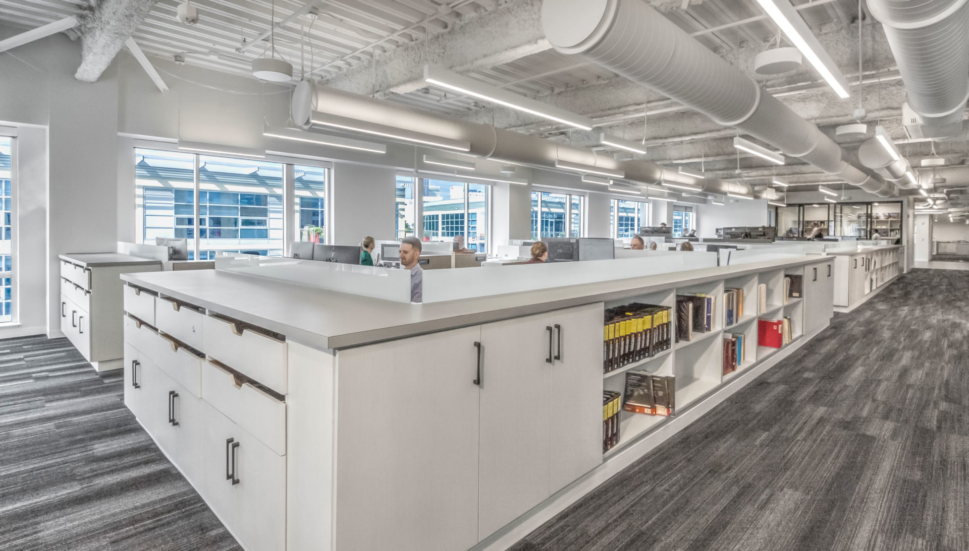
The design studio space features exposed structure and systems with pendant lights for a spacious, sleek, industrial feel.
A variety of collaborative spaces are incorporated throughout the office to support different types of interaction – informal and formal, private and public, large and small groups, pin up and markerboard, and both fixed and flexible seating. For example, focus rooms for small meetings are equipped with large standing height tables that can be arranged around the TV monitor or pinup wall. To accommodate larger volumes of people at once, a large conference room with flexible functionality can be opened and conjoined with the adjacent break room for added space. Additional amenities include a wellness room, model shop, materials library, and large kitchen area with a mix of seating options.
One of the primary goals was to create an entryway that would serve as a focal point. Showcasing the “heart” of the office, the resulting entrance piques visual interest with solid, thick walls of polished quartz contrasted with floor-to-ceiling panes of glass. The entire front wall is glass, allowing views into the office and to the cityscape beyond. Mixing materials for a diverse palette, the ceilings feature wood planks of varying sizes, accented by linear streaks of natural light. This entrance area is also utilized as a breakout space for employees.
To maximize daylight and provide visual breaks in a space that could feel long and repetitive, the team capitalized on the height of the main office area. The design studio space features exposed structure and systems with pendant lights for a spacious, sleek, industrial feel. With a neutral color palette, wood accents, and crisp white walls, the materiality ensures the space feels tall, open, and illuminated.
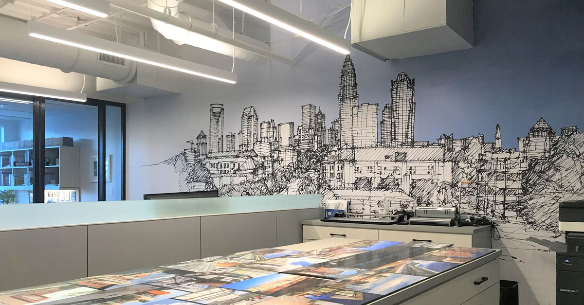 The design team got creative when faced with a 25-foot long windowless demising wall at one end of the space. Kevin Utsey, FAIA, preserved a special element of the old office by sketching the former view of uptown Charlotte, which was enlarged to 1700% and transformed into a series of three-foot wide by twelve-foot tall adhesive panels to create a billboard-like effect.
